REBRANDING · maastricht
STOKED
A Board sports association
BUILT FOR
THE OUTSIDE

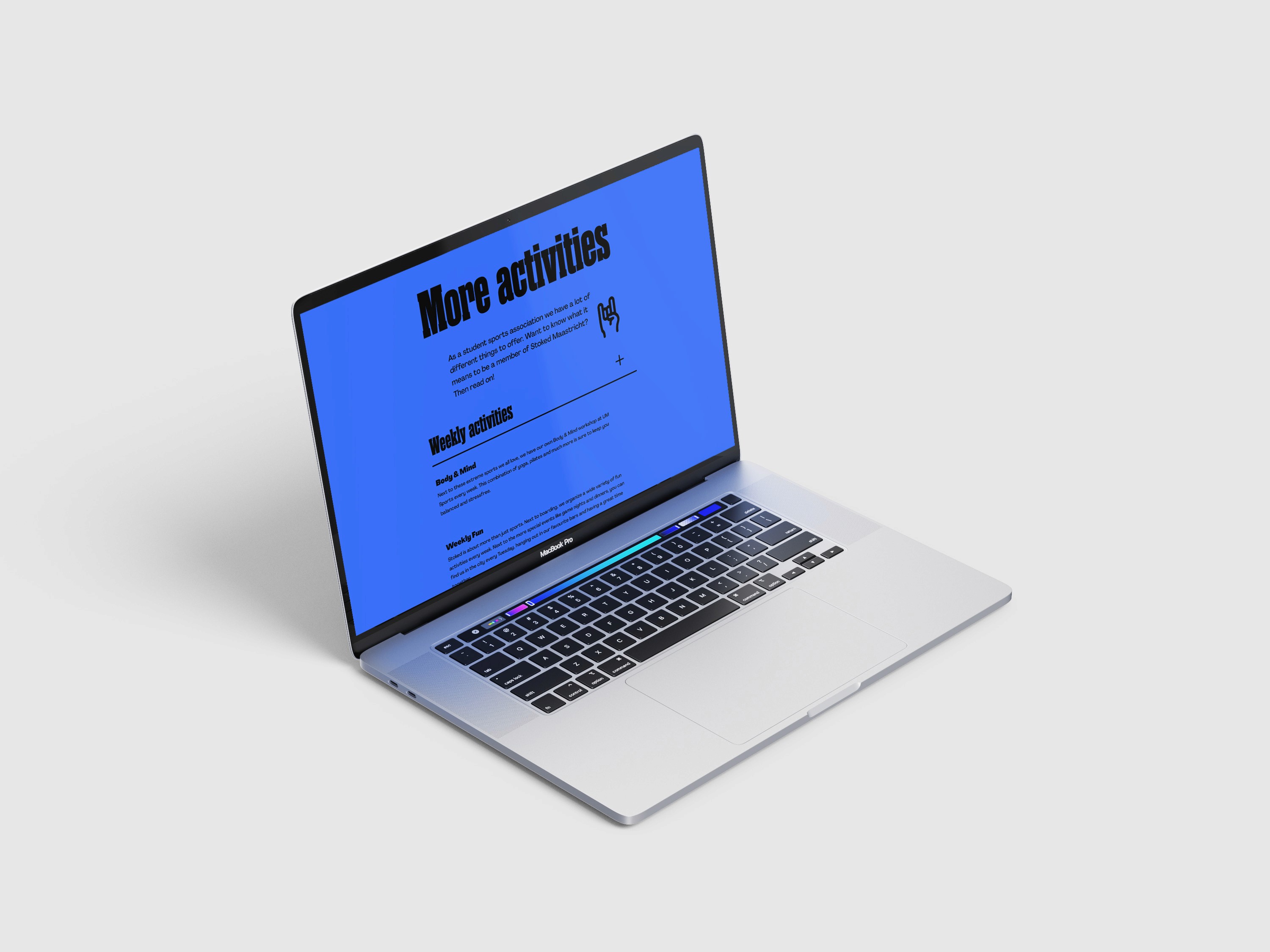
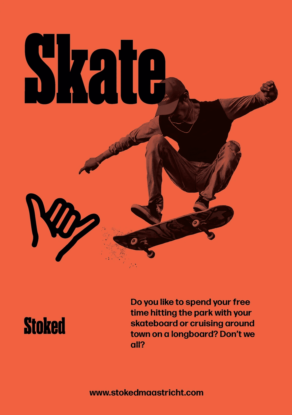
Stoked’s identity is designed around momentum, community, and the shared energy of board sports. The system gives the association a bolder, more flexible presence for member communication, events, and the everyday culture around the sport.

The new visual identity for Stoked, represents the core values of the association and and establishes a unified visual language that strongly connects with its target audience. It features a vibrant colour palette, exuding energy and movement while maintaining a sense of professionalism and readability through a typography system.
Scroll and click through the design below to see more!